Was sitting at home trying to find a good type related post for my blog and couldn't think of anything. In an act of desperation I finally decided to post something about famous type designers.
http://mokokoma.co.za/the-faces-behind-20-famous-typefaces/
I had this stored around for a later use and realized this is the later use. Its interesting to look at the typefaces and the faces behind 20 of the famous typefaces used today.
Enjoy!
Saturday, April 30, 2011
Thursday, April 21, 2011
"A Little A.M. in the pm"
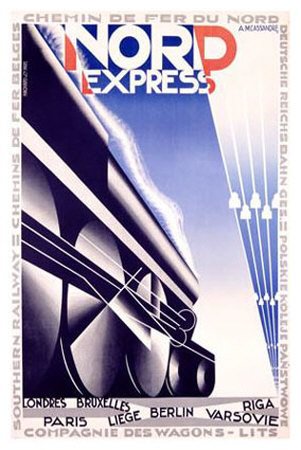
Adolphe Mouron Cassandre (24 January 1901 – 17 June 1968), is probably on of the most influenential and most copied Graphic Designers of the 20th Century. He is most famously known for his poster designs during the 20's and 30's (before entering WWII). As a designer,Cassandre developed the following typefaces Bifur in 1929, the sans serif Acier Noir in 1935, and in 1937 an all-purpose font called Peignot. He also designed the Yves Saint Laurent logo. Tragically, Cassandre suffered from despression in his later years and committed suicide.
Samples of his work:


Samples of his work:


Thursday, April 14, 2011
"Animal Type"
While researching great examples of Typography I came across these advertisments for the US Preventive Medicine/ The Prevention Plan as was really impressed by what they were able to make with just the type and the words:


 Very creative use of negative medical text create killer animals.


Thursday, April 7, 2011
" A Phenomenal Graphic Designer- Leslie Cabarga"
way back in my second post I spoke about a book that I loved the typeface of the cover. The book was by Leslie Cabarga and since we are discussing type editing software i thnink its a good time to feature his work. He has developed fonts for use and has written a book on using type editing software called, Learn FontLab Fast,
 The book shows you have to use fontographer and Typetool as well. Overall it is a very good book and makes a whole lot more sense after taking Typography 110.
His site, http://www.lesliecabarga.com/ , provides a great example of what a Graphic Designer can do.
His site, http://www.lesliecabarga.com/ , provides a great example of what a Graphic Designer can do.
Wednesday, March 30, 2011
"Comic Book lettering that I love"
I release that comic book font is a no-no but I have to admit that this was my first and most memorable exposure to typography, especially decorative type. One decorative style type used to create one of the most enduring (according to me) comic book character's logo can be found at the following: http://www.aquamanshrine.com/2009/06/aquaman-logos.html and seen below:


Yes, I realize that it is for Aquaman and he has been lampooned in the media as being the joke of the superhero community because he "talks to fish". to a kid who could not swim and wanted to he was the greatest! Superman, Batman, Green Lantern and Green Arrow all had talents/abilities a young middle class boy could not readily aquire (the ability to fly, access to millions of dollars, a green power ring and little blue friends and a bow and arrow (parents frowned on weapons).
So, yes I am an Aquaman fan and I love his logo.....
Wednesday, March 16, 2011
"Some of the most controversial magazne covers of all time..."
While I was researching editorial covers for project three, I came across the link http://www.webdesignerdepot.com/2009/09/the-most-controversial-magazine-covers-of-all-time/ and was amazed at what they thought was controversial...

 The LeBron and Gisele cover is supposed to be controversial because of the underlying racial connotations related the violent black man and King Kong deal (don't quite see that but could see the whole mandingo fantasy working here though).
Clinton's cover, because its a crotch shot, taa daa!!!!!

 These two I'm struggling with. Demi's cover is very beautiful in its depiction of motherhood (I choose to say this instead of womanhood because bearing children does not denote a woman's worth she is a woman regardless of having children or not...I am now off my soapbox). As for the KD Lang and Cindy Crawford cover, I wanted to be in KD's place (envy plan and simple).
These final two are, yeah, controversial... The Economist cover is wrong, funny as hell, but tragically wrong. The Rolling Stone cover is controversial because it has Yoko in it.


Clinton's cover, because its a crotch shot, taa daa!!!!!


These final two are, yeah, controversial... The Economist cover is wrong, funny as hell, but tragically wrong. The Rolling Stone cover is controversial because it has Yoko in it.


Wednesday, March 9, 2011
"Editorial Cover Designs"
Project 3 deals with designing a cover (using primarily type) for a special edition of a weekly insert for a newspaper and we were charged with finding good examples of magazine covers illustrating this. So here goes:
1)How Magazine 25th Anniversary Issue

2) Mixtapes Magazine Mixtape Awards issue

3) Grapik Magazine


4) Web Designer and Black Enterprise Magazines


5)
6) Ebony and Spin Magazine - (sorry for the use of a hyphen when an em dash was called for) These are not really good examples of type driven editorial covers but these two used Marvin Gaye and Prince. You can't really go wrong with having MR "Let's Get it on" and MR "Erotic City" on your cover...


7)Communication Arts and New York Magazines- These are covers that did not appeal to me but I felt the need to include them.


Subscribe to:
Comments (Atom)